I’ve open-sourced a simple Coronavirus (COVID-19) dashboard
I've recently open-sourced a new 📈 Coronavirus (COVID-19) Dashboard which shows the dynamics (the curvature of the graph) of Сoronavirus distribution per country.
Reasoning
The reason for creating a new dashboard was to complement the well-known JHU Dashboard (which is made by Johns Hopkins CSSE) with the feature of seeing the charts with the number of COVID-19 confirmed / recovered/ deaths use-cases per country.
Basically, I personally had a question like "What about the Netherlands/Ukraine?", "Is the virus spread (growth factor) slowing down?", "How I can compare the recovered/deaths dynamics per-country?", "Which countries are doing the proper things to slow down the growth-factor".
Here is how the main function looks like:
Data source and tech-stack
The dashboard is using COVID-19 (2019-nCoV) Data Repository by Johns Hopkins CSSE as a data source.
Front-end wise I've tried to make it as simple as possible, therefore the dashboard is using a pure React.js (without JSX transpiler or CreateReactApp starter). To display the data I've used Charts.js to draw the chart and Bootstrap Table to display a sortable, searchable, and clickable data table.
Main Functionality
The dashboard is still raw, but it provides the basic functionality of displaying the global and per-country data charts.
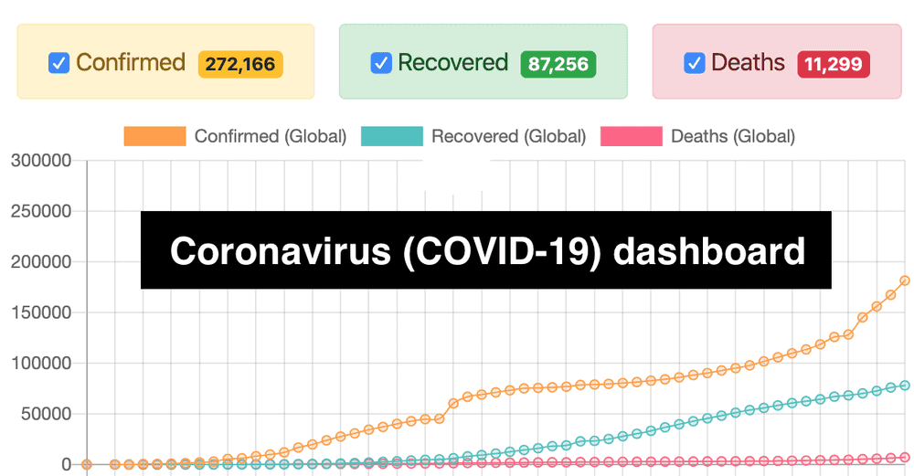
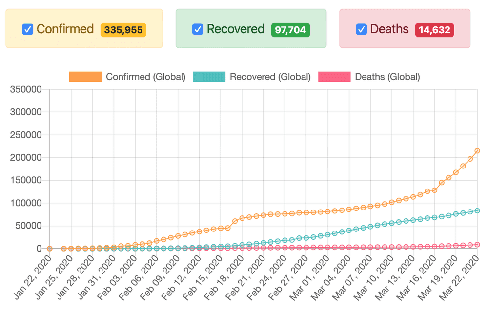
For example here is how Global dynamics of confirmed/recovered/deaths use-cases looks like as for March 23rd:
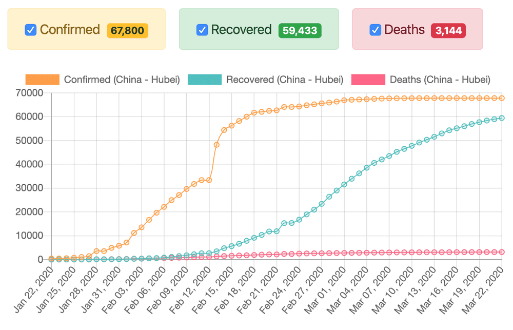
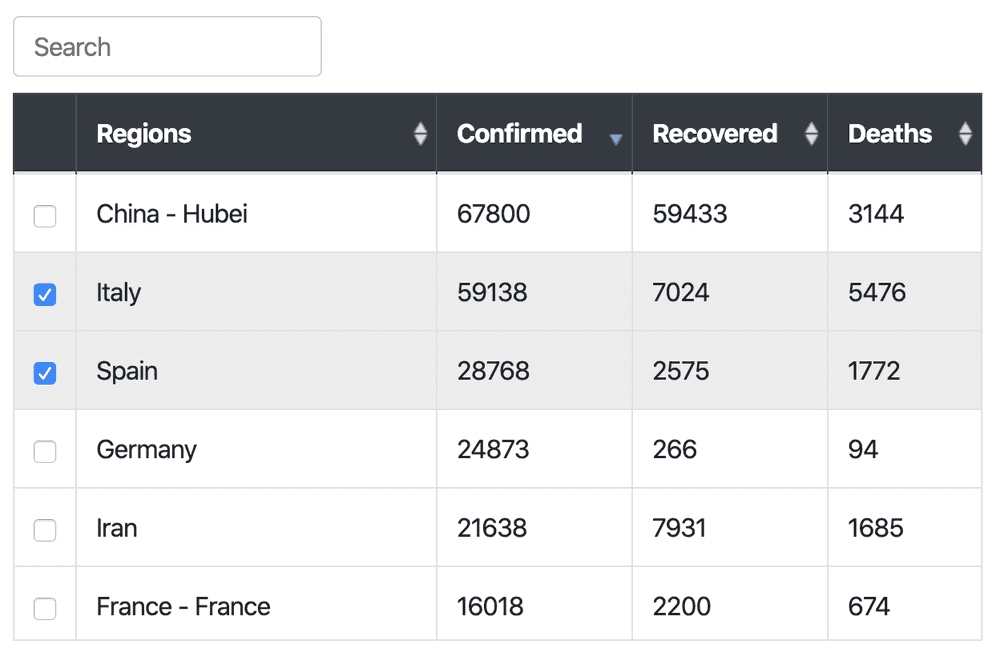
Here we may see positive dynamics for China (Hubei):
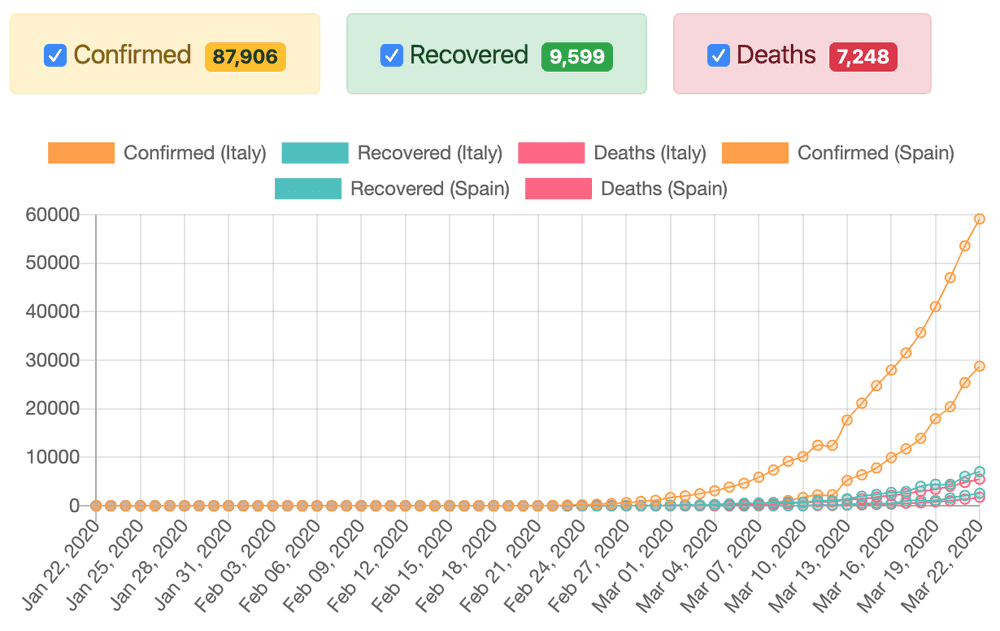
We may also compare Italy to Spain:
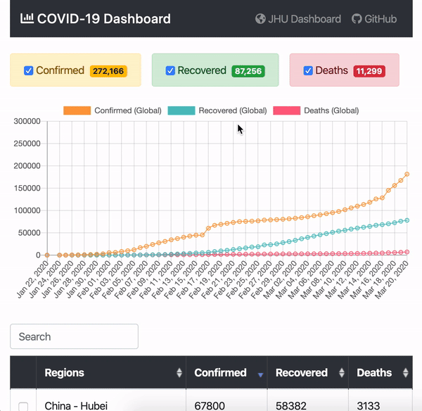
The regions are displayed in sortable, searchable, and clickable data-table:
Known issues
The following functionality is not implemented yet but it would improve the usability of the dashboard:
- Grouping the regions by countries to see aggregated statistics for the whole US, China, etc. (for now statistics for the US is split by states)
- Resetting the regions/countries selection by one click
- Putting the selected filters to the URL so that the dashboard link would be sharable (with pre-selected filters)
Subscribe to the Newsletter
Get my latest posts and project updates by email